Case Study
Scaling the Versapay Design System
From Wedges to MUI: A Journey of Migration, Governance, and Empowerment
Product Design
Design System
Team enablement
Governance
Project Overview
Duration
Q2 2025 - Ongoing
Team Size
2 Designers, 2 Engineers, 1 PM
My Role
System Architect/Designer, Governance Owner, Team Educator
Context
From Wedges to MUI:A Journey of Migration, Governance, and Empowerment
After launched Versapay’s first design system in 2023–2024, I was tasked with leading its evolution in early 2025. What started as a UI refresh based on Wedges turned into a full migration to Material UI (MUI)—driven by technical scalability, component reuse, and real-time demands from a new Collection Module under development.
This case study shares how I led that transition—building not just components, but a system built for people: scalable, maintainable, accessible, and actively adopted across teams.

Why Redesign a Working System?
By Q1 2025, our existing design system—based on on Wedges—showed clear signs of friction:
- Limited scalability for larger modules.
- Token explosion and naming inconsistencies.
- No mobile considerations (depriotised).
- Developer team voiced that the existing framework wasn't sustainable for new products.
My role
- System Architect
- Governance Owner
- Dev Partner
- Team Educator
- Content Designer

Design Process
So, what did I do?
Step by step.
Phase 1 /
Auditing & Strategic Simplification
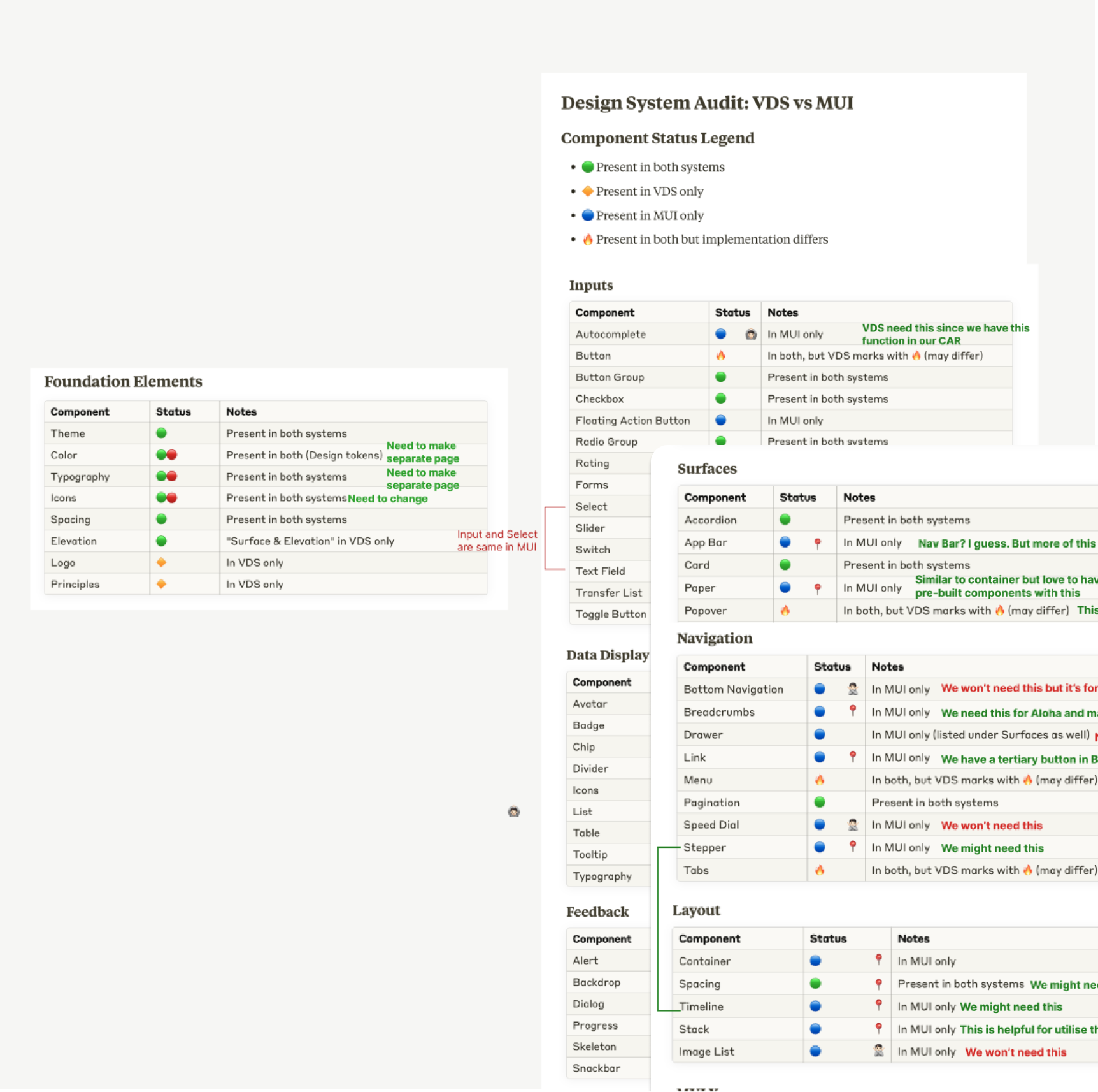
I began with a full audit:
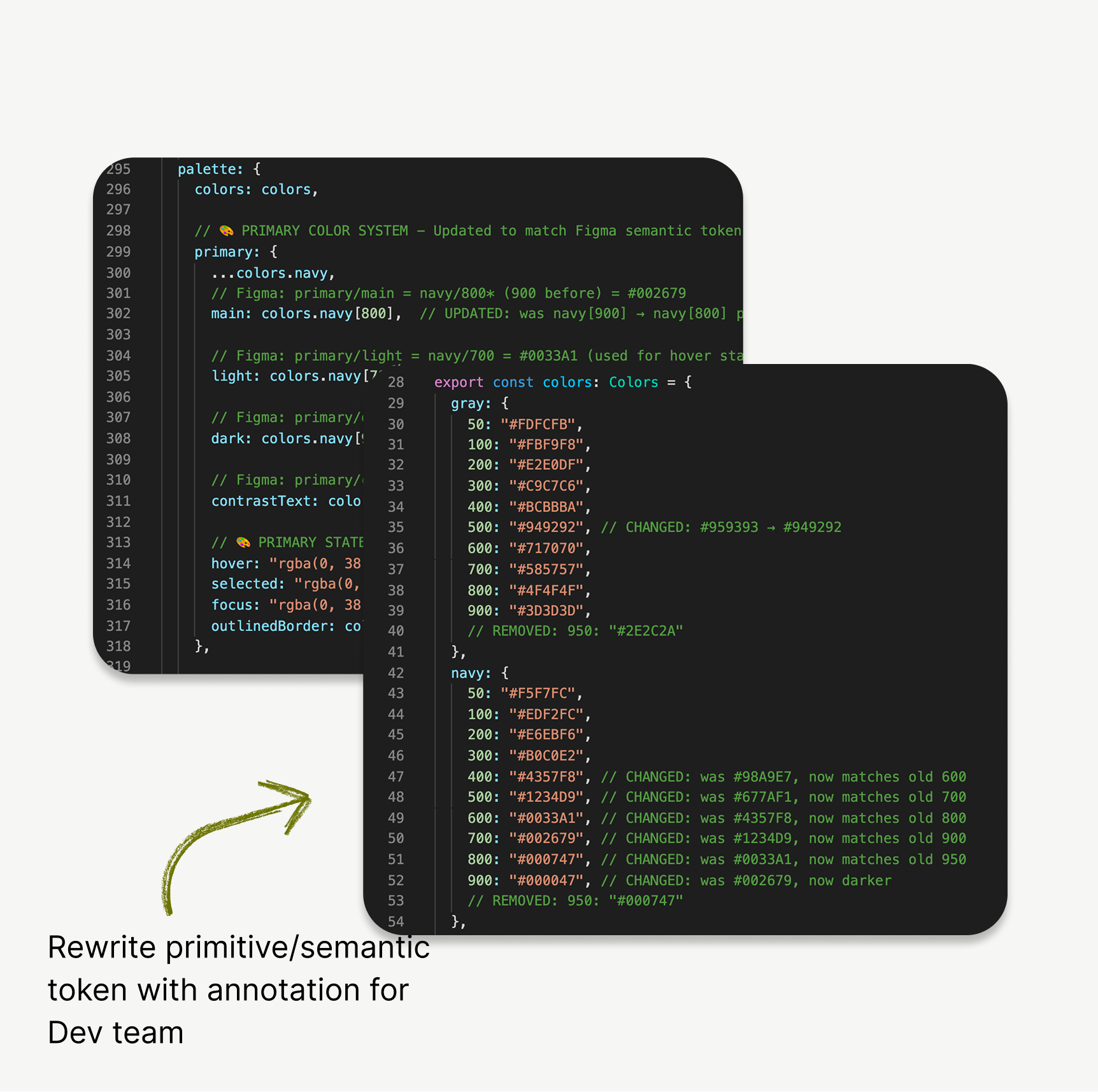
- Identified all Wedges-based tokens, components, and patterns.
- Classified them into: Keep / Remove / Refactor buckets.
- Studied MUI’s token system to find ways to reduce redundancy.
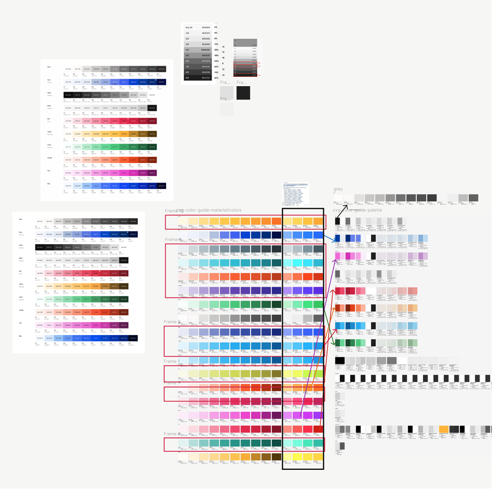
Color mapping → Auditing
Components Audit / Classifying
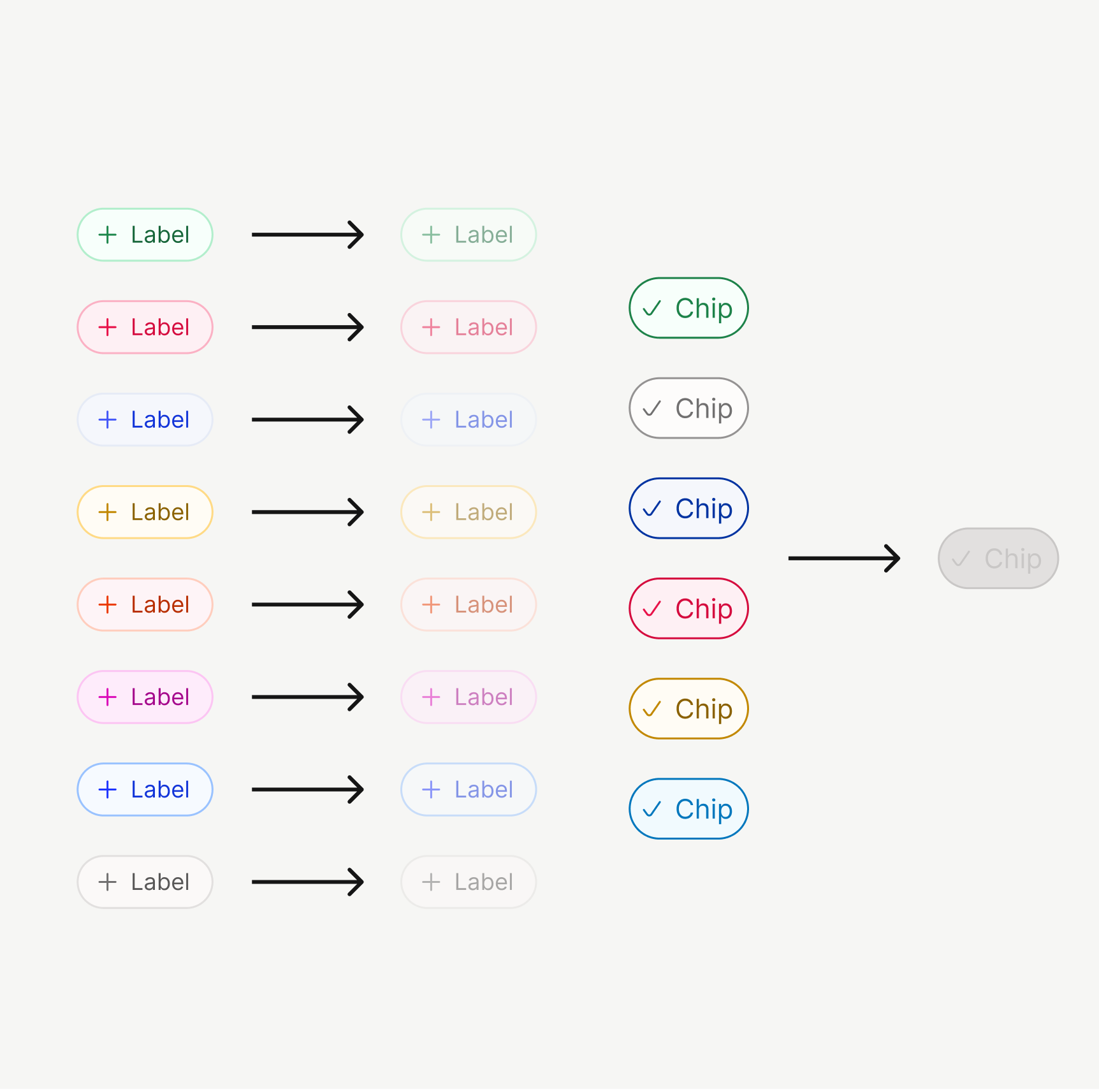
Example fix:
In Wedges, every chip’s disabled state had its own token. I consolidated these to a single accessible style, reducing confusion and increasing dev reusability.
Original VDS / VDS with MUI

I also upgraded the system to include:
- Mobile-first guidelines (touch target, adaptive spacing)
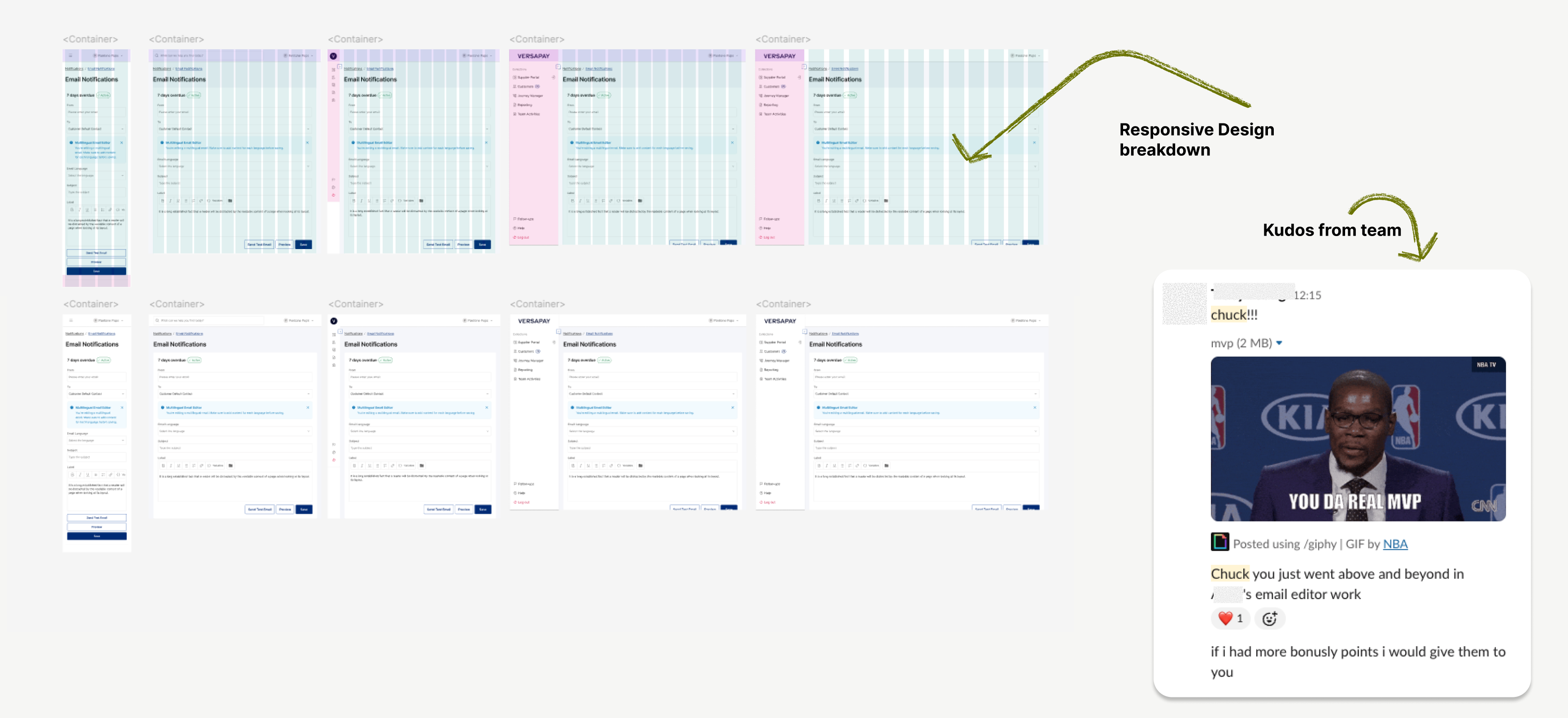
- A new grid system for responsiveness, applied to real cases like the Email Editor (previous VDS didn’t consider Mobile guidelines.)
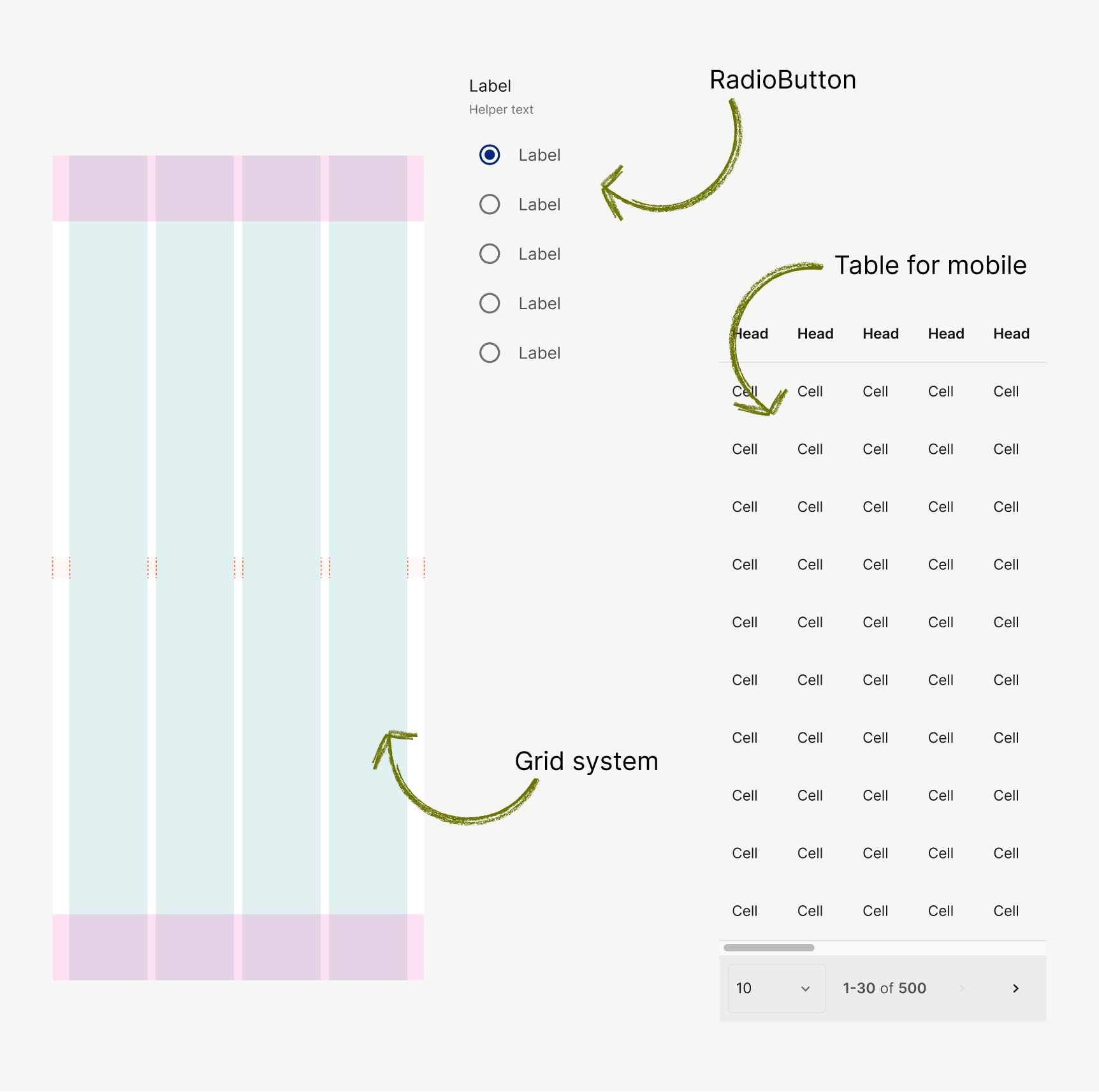
Mobile-first guideline
Phase 2
QA, Governance, and Empowerment
I started to focus on team adoption.
This wasn’t just about components — it was about adoption.
Governance
- Set up Slack channel + custom issue form for live feedback.
- Drafted lightweight governance process: issue categories, ownership, triage path.
Including those files
* 📘 Component usage guide
* 📔 Token guide (mapping)
* 🦮 Content design guideline
* 🛠 Prioritisation criteria
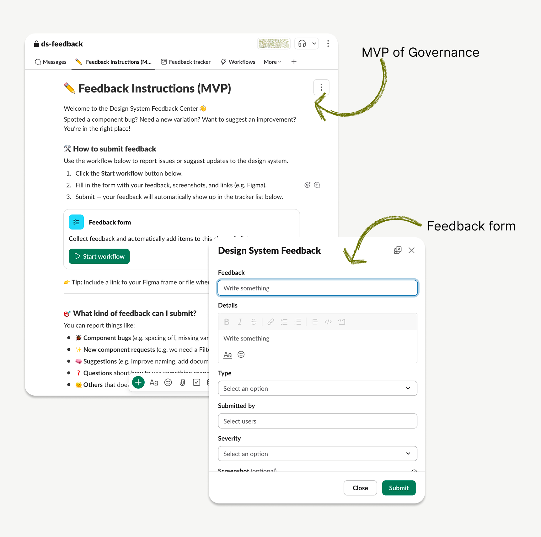
#ds-feedback Channel
QA Process
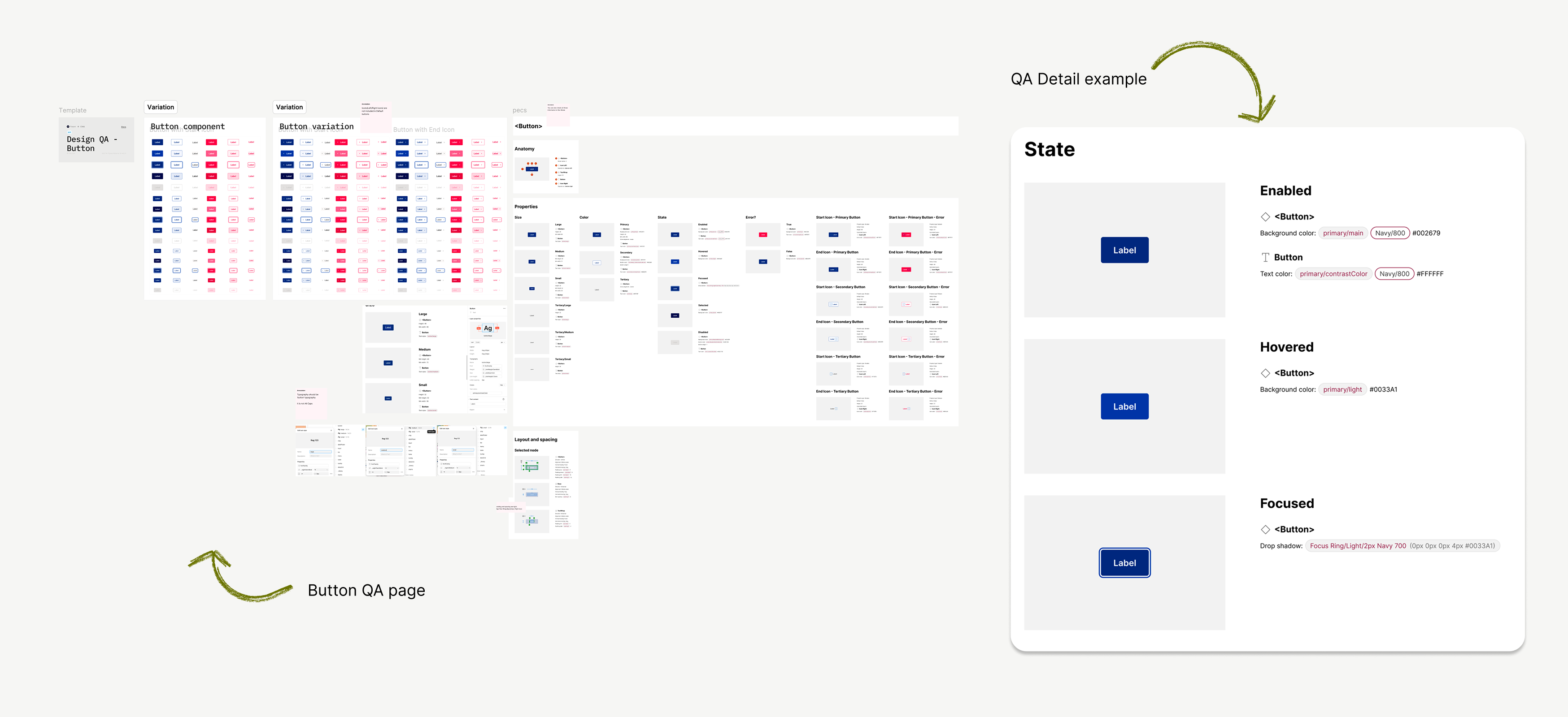
- Conducted deep QA on components (e.g. Buttons, Inputs).
- Created a QA status table with detailed references.
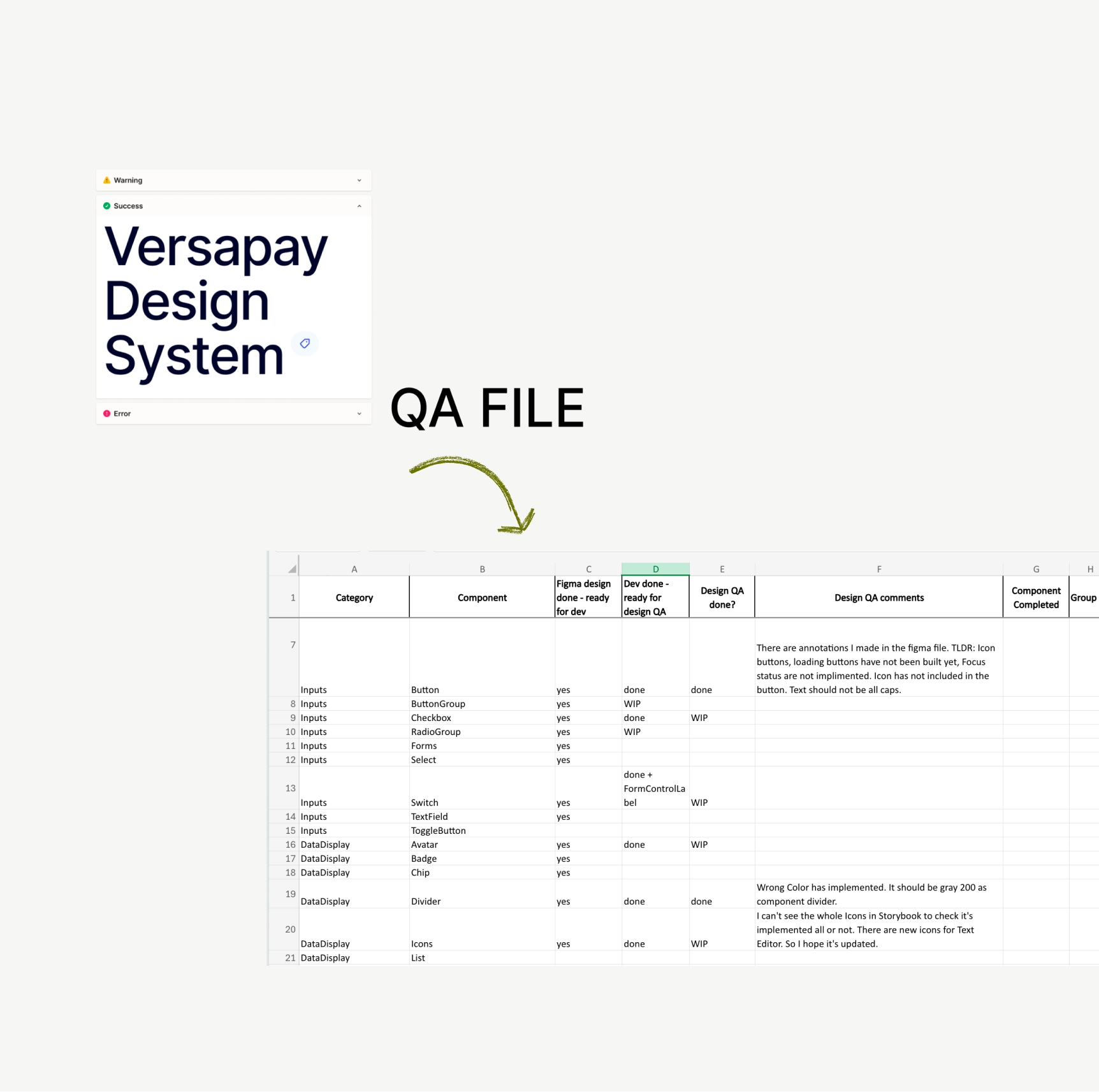
Design system QA table
Dev/Design Token Alignment
One of the hardest challenges was reconciling MUI token structure with our previous one.
So, I:
- Ran feasibility syncs with developers.
- Published an interactive Figma Token Guide to map tokens clearly.
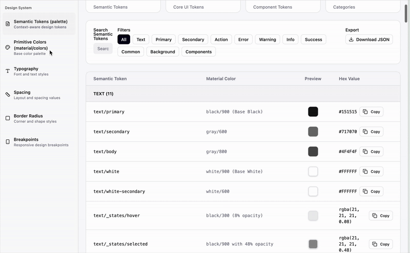
Interactive Document for Token usage.

Interactive token mapping site
I began with a full audit:
- Identified all Wedges-based tokens, components, and patterns.
- Classified them into: Keep / Remove / Refactor buckets.
- Studied MUI’s token system to find ways to reduce redundancy.

Token alignment / Async with Global team
Interactive token mapping site
Phase 3
Real-World Integration & Developer Partnership
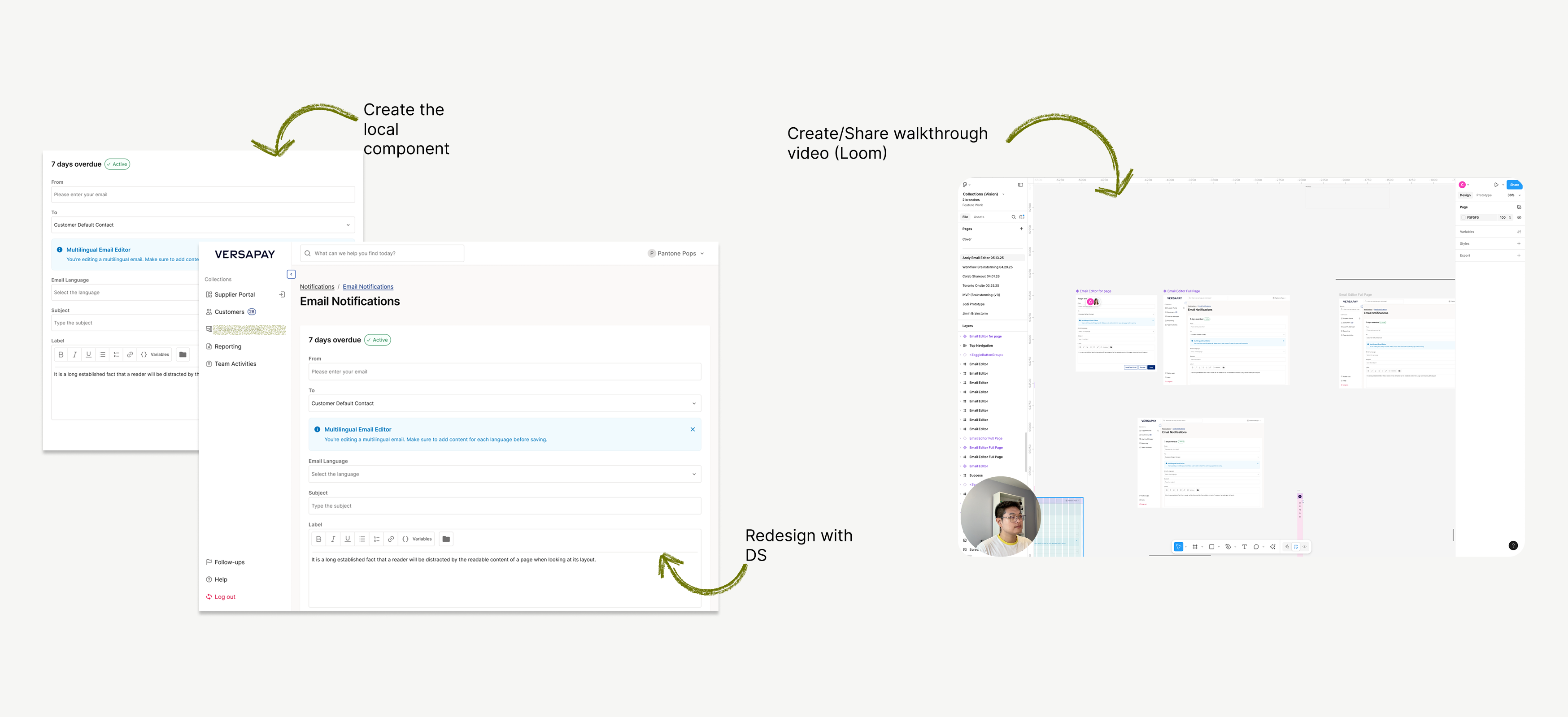
Notable example: Email Editor
- Originally mocked up in wireframes, I stepped in to rebuild it using the new system.
- I redesigned the page from scratch using tokens and components I had built.
Result: team clarity + dev speed.

Email Editor (other designer ver.)
The new Collection Module was the first to adopt the new system.
Instead of completing everything before rollout, we took a progressive prioritisation approach—components were migrated as features demanded.

Email Editor
Steps I went through:
Audit designer’s file first→ Find a problem→ Suggest the work process with DS
→ Use it as an educational resource/opportunity
Team enablement
To ensure designers didn’t just know “what to use” but also “how”, I created:
- Walkthrough Loom videos for component usage.
- Shared how to apply the new system through live sessions.
- Authored Content Design Guidelines to expand the system beyond UI into UX writing.
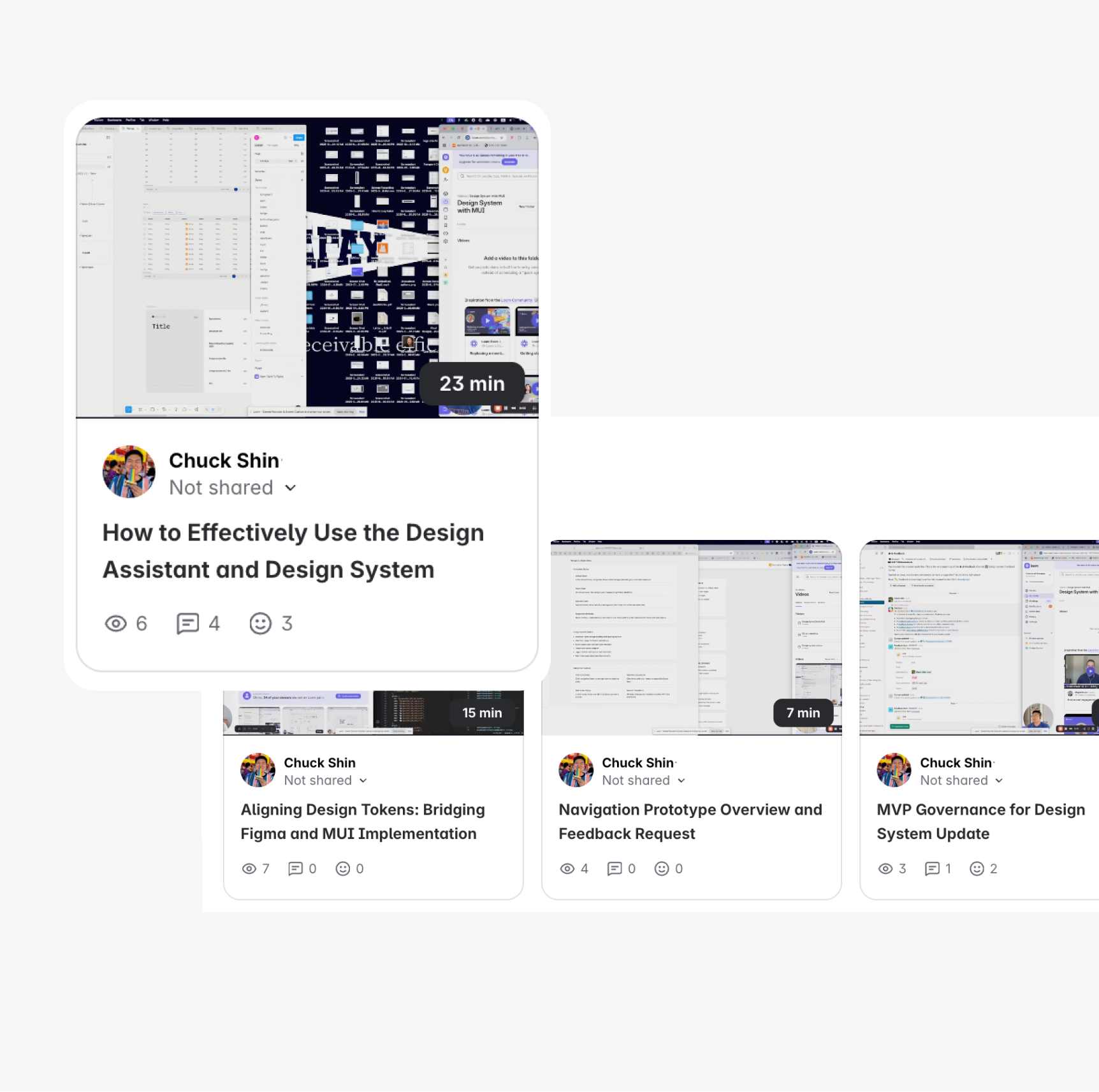
Loom video library
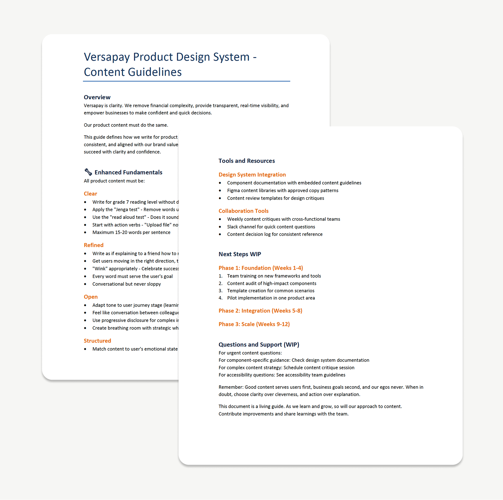
Content design guideline
My mindset:
“A design system is not a deliverable — it’s an iterative process.”
I constantly shared in-progress decisions with peers, reviewed edge cases with Designers and PMs, and welcomed critiques.
Impact & Outcomes
Adoption
Multiple designers are now using the system in real builds. It’s taking times. 2 product teams started using design system to build module and features and one other team is preparing to use design system.
Scalability
Fewer tokens (256 → 164), consistent patterns, and mobile-friendly thinking.
Trust
Design, PM, and Dev leaders now see me as the system owner.
Efficiency
Devs build faster, designers can build faster and utilise Figma make with our design system for realistic prototype.
Reflection & Learnings
Most difficult?
Aligning MUI’s structure with our existing visual language without breaking dev velocity or ADA compliance.
Most rewarding?
Seeing other designers use a system I built, and being trusted to lead it. Fully ownership for design system.
Case Study
Scaling the Versapay Design System
From Wedges to MUI: A Journey of Migration, Governance, and Empowerment
Product Design
Design System
Team enablement
Governance
Project Overview
Duration
Q2 2025 - Ongoing
Team Size
2 Designers, 2 Engineers, 1 PM
My Role
System Architect/Designer, Governance Owner, Team Educator
Context
From Wedges to MUI:A Journey of Migration, Governance, and Empowerment
After launched Versapay’s first design system in 2023–2024, I was tasked with leading its evolution in early 2025. What started as a UI refresh based on Wedges turned into a full migration to Material UI (MUI)—driven by technical scalability, component reuse, and real-time demands from a new Collection Module under development.
This case study shares how I led that transition—building not just components, but a system built for people: scalable, maintainable, accessible, and actively adopted across teams.
Why Redesign a Working System?
By Q1 2025, our existing design system—based on on Wedges—showed clear signs of friction:
- Limited scalability for larger modules.
- Token explosion and naming inconsistencies.
- No mobile considerations (depriotised).
- Developer team voiced that the existing framework wasn't sustainable for new products.
My role
- System Architect
- Governance Owner
- Dev Partner
- Team Educator
- Content Designer
Design Process
So, what did I do?
Step by step.
Phase 1 /
Auditing & Strategic Simplification
I began with a full audit:
- Identified all Wedges-based tokens, components, and patterns.
- Classified them into: Keep / Remove / Refactor buckets.
- Studied MUI’s token system to find ways to reduce redundancy.
Color mapping → Auditing
Components Audit / Classifying
Example fix:
In Wedges, every chip’s disabled state had its own token. I consolidated these to a single accessible style, reducing confusion and increasing dev reusability.
Original VDS / VDS with MUI
I also upgraded the system to include:
- Mobile-first guidelines (touch target, adaptive spacing)
- A new grid system for responsiveness, applied to real cases like the Email Editor (previous VDS didn’t consider Mobile guidelines.)
Mobile-first guideline
Phase 2
QA, Governance, and Empowerment
I started to focus on team adoption.
This wasn’t just about components — it was about adoption.
Governance
- Set up Slack channel + custom issue form for live feedback.
- Drafted lightweight governance process: issue categories, ownership, triage path.
Including those files
* 📘 Component usage guide
* 📔 Token guide (mapping)
* 🦮 Content design guideline
* 🛠 Prioritisation criteria
#ds-feedback Channel
QA Process
- Conducted deep QA on components (e.g. Buttons, Inputs).
- Created a QA status table with detailed references.
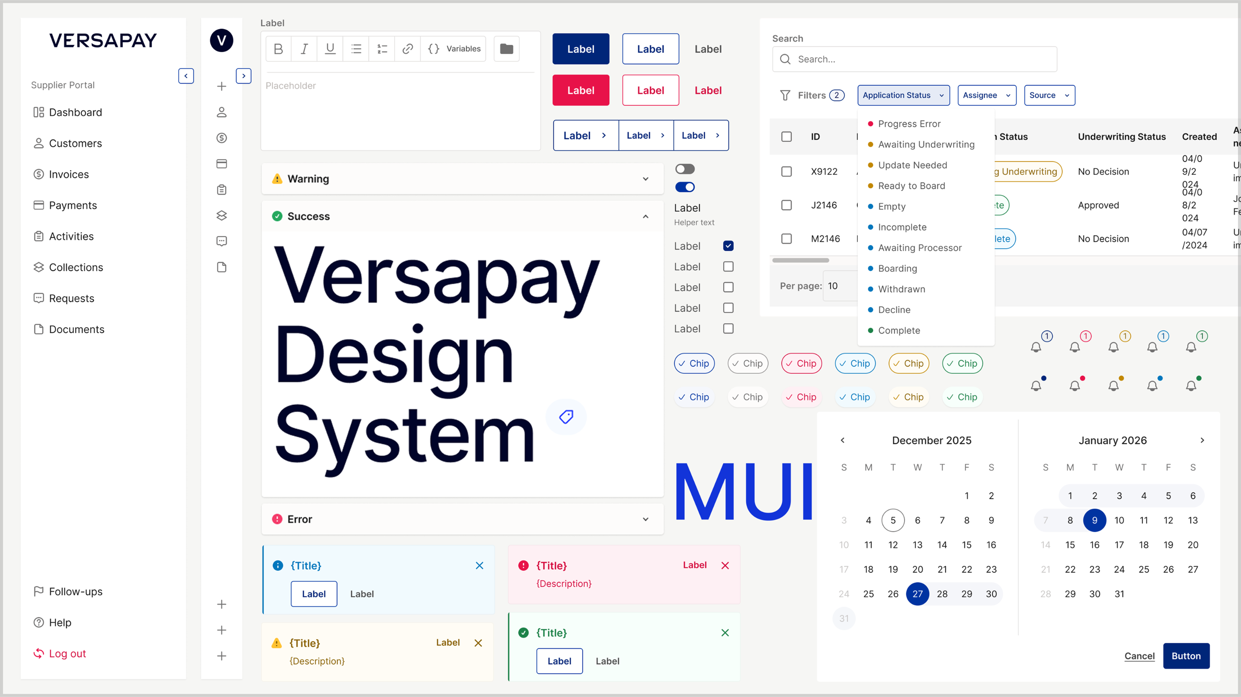
Design system QA table
Dev/Design Token Alignment
One of the hardest challenges was reconciling MUI token structure with our previous one.
So, I:
- Ran feasibility syncs with developers.
- Published an interactive Figma Token Guide to map tokens clearly.
Interactive Document for Token usage.
Interactive token mapping site
I began with a full audit:
- Identified all Wedges-based tokens, components, and patterns.
- Classified them into: Keep / Remove / Refactor buckets.
- Studied MUI’s token system to find ways to reduce redundancy.
Token alignment / Async with Global team
Interactive token mapping site
Phase 3
Real-World Integration & Developer Partnership
Notable example: Email Editor
- Originally mocked up in wireframes, I stepped in to rebuild it using the new system.
- I redesigned the page from scratch using tokens and components I had built.
Result: team clarity + dev speed.
Email Editor (other designer ver.)
The new Collection Module was the first to adopt the new system.
Instead of completing everything before rollout, we took a progressive prioritisation approach—components were migrated as features demanded.
Email Editor
Steps I went through:
Audit designer’s file first→ Find a problem→ Suggest the work process with DS
→ Use it as an educational resource/opportunity
Team enablement
To ensure designers didn’t just know “what to use” but also “how”, I created:
- Walkthrough Loom videos for component usage.
- Shared how to apply the new system through live sessions.
- Authored Content Design Guidelines to expand the system beyond UI into UX writing.
Loom video library
Content design guideline
My mindset:
“A design system is not a deliverable — it’s an iterative process.”
I constantly shared in-progress decisions with peers, reviewed edge cases with Designers and PMs, and welcomed critiques.
Impact & Outcomes
Adoption
Multiple designers are now using the system in real builds. It’s taking times. 2 product teams started using design system to build module and features and one other team is preparing to use design system.
Scalability
Fewer tokens (256 → 164), consistent patterns, and mobile-friendly thinking.
Trust
Design, PM, and Dev leaders now see me as the system owner.
Efficiency
Devs build faster, designers can build faster and utilise Figma make with our design system for realistic prototype.
Reflection & Learnings
Most difficult?
Aligning MUI’s structure with our existing visual language without breaking dev velocity or ADA compliance.
Most rewarding?
Seeing other designers use a system I built, and being trusted to lead it. Fully ownership for design system.
Contents
Case Study
Scaling the Versapay Design System
From Wedges to MUI: A Journey of Migration, Governance, and Empowerment
Product Design
Design System
Team enablement
Governance
Project Overview
Duration
Q2 2025 - Ongoing
Team Size
2 Designers, 2 Engineers, 1 PM
My Role
System Architect/Designer, Governance Owner, Team Educator
Context
From Wedges to MUI:A Journey of Migration, Governance, and Empowerment
After launched Versapay’s first design system in 2023–2024, I was tasked with leading its evolution in early 2025. What started as a UI refresh based on Wedges turned into a full migration to Material UI (MUI)—driven by technical scalability, component reuse, and real-time demands from a new Collection Module under development.
This case study shares how I led that transition—building not just components, but a system built for people: scalable, maintainable, accessible, and actively adopted across teams.
Why Redesign a Working System?
By Q1 2025, our existing design system—based on on Wedges—showed clear signs of friction:
- Limited scalability for larger modules.
- Token explosion and naming inconsistencies.
- No mobile considerations (depriotised).
- Developer team voiced that the existing framework wasn't sustainable for new products.
My role
- System Architect
- Governance Owner
- Dev Partner
- Team Educator
- Content Designer
Design Process
So, what did I do?
Step by step.
Phase 1 /
Auditing & Strategic Simplification
I began with a full audit:
- Identified all Wedges-based tokens, components, and patterns.
- Classified them into: Keep / Remove / Refactor buckets.
- Studied MUI’s token system to find ways to reduce redundancy.
Color mapping → Auditing
Components Audit / Classifying
Example fix:
In Wedges, every chip’s disabled state had its own token. I consolidated these to a single accessible style, reducing confusion and increasing dev reusability.
Original VDS / VDS with MUI
I also upgraded the system to include:
- Mobile-first guidelines (touch target, adaptive spacing)
- A new grid system for responsiveness, applied to real cases like the Email Editor (previous VDS didn’t consider Mobile guidelines.)
Mobile-first guideline
Phase 2
QA, Governance, and Empowerment
I started to focus on team adoption.
This wasn’t just about components — it was about adoption.
Governance
- Set up Slack channel + custom issue form for live feedback.
- Drafted lightweight governance process: issue categories, ownership, triage path.
Including those files
* 📘 Component usage guide
* 📔 Token guide (mapping)
* 🦮 Content design guideline
* 🛠 Prioritisation criteria
#ds-feedback Channel
QA Process
- Conducted deep QA on components (e.g. Buttons, Inputs).
- Created a QA status table with detailed references.
Design system QA table
Dev/Design Token Alignment
One of the hardest challenges was reconciling MUI token structure with our previous one.
So, I:
- Ran feasibility syncs with developers.
- Published an interactive Figma Token Guide to map tokens clearly.
Interactive Document for Token usage.
Interactive token mapping site
I began with a full audit:
- Identified all Wedges-based tokens, components, and patterns.
- Classified them into: Keep / Remove / Refactor buckets.
- Studied MUI’s token system to find ways to reduce redundancy.
Token alignment / Async with Global team
Interactive token mapping site
Phase 3
Real-World Integration & Developer Partnership
Notable example: Email Editor
- Originally mocked up in wireframes, I stepped in to rebuild it using the new system.
- I redesigned the page from scratch using tokens and components I had built.
Result: team clarity + dev speed.
Email Editor (other designer ver.)
The new Collection Module was the first to adopt the new system.
Instead of completing everything before rollout, we took a progressive prioritisation approach—components were migrated as features demanded.
Email Editor
Steps I went through:
Audit designer’s file first→ Find a problem→ Suggest the work process with DS
→ Use it as an educational resource/opportunity
Team enablement
To ensure designers didn’t just know “what to use” but also “how”, I created:
- Walkthrough Loom videos for component usage.
- Shared how to apply the new system through live sessions.
- Authored Content Design Guidelines to expand the system beyond UI into UX writing.
Loom video library
Content design guideline
My mindset:
“A design system is not a deliverable — it’s an iterative process.”
I constantly shared in-progress decisions with peers, reviewed edge cases with Designers and PMs, and welcomed critiques.
Impact & Outcomes
Adoption
Multiple designers are now using the system in real builds. It’s taking times. 2 product teams started using design system to build module and features and one other team is preparing to use design system.
Scalability
Fewer tokens (256 → 164), consistent patterns, and mobile-friendly thinking.
Trust
Design, PM, and Dev leaders now see me as the system owner.
Efficiency
Devs build faster, designers can build faster and utilise Figma make with our design system for realistic prototype.
Reflection & Learnings
Most difficult?
Aligning MUI’s structure with our existing visual language without breaking dev velocity or ADA compliance.
Most rewarding?
Seeing other designers use a system I built, and being trusted to lead it. Fully ownership for design system.